Does Website Size Impact SEO and UX-UI?
If you’ve noticed, the GTV SEO website has recently updated its size and UX/UI. Surprisingly, many keywords suddenly ranked higher—previously, they were stuck on page 2 or in positions 7 or 8. Therefore, I reassessed these changes and concluded that the size of the website has a significant impact on SEO, especially on user experience.
In this article, I will guide you in detail on this definition. Let’s get started.
Website Sizes You Need to Know
Hmm, in reality, a website designed with an attractive style is like a beautifully arranged shop. Why do I compare them like this? Because both can impress you and enhance your “shopping skills” (reading blogs, buying products, using services, etc.). But first, let’s make Google, our “landlord,” happy.
Thus, to achieve this, you also need to follow the criteria set by Google. Among the more than 200 factors that Google uses to rank your website, the website size is one of them.
Not to mention whether your images are beautiful or sharp, Google will prioritize size first because its bot only reads the size and alt tags. Quality certainly matters too, as it optimizes user experience.

See more products: Buy advertising accounts
Here are some website sizes you need to keep in mind:
-
Fixed Layout (Standard Size): A fixed size where the width is set at a specific value.
-
Fluid Layout (Responsive Size): The size is calculated based on a percentage, so the width of the website can adjust according to the browser size.
-
Elastic Layout (Flexible Size): A combination of the two above.
Additionally, pay attention to the size of banners, slider images on the homepage, images within articles, and product images.
Units for Website Sizes
-
Pt, pc, cm, mm, in: These are absolute standard sizes, meaning they do not change when you change the display device (computer, phone, etc.). For example, if you use a 12pt Times New Roman font, all devices will display it the same.
-
Px (Pixel): A pixel is a unit of measurement for a point on the screen. A screen usually has many small points. For example, a Full HD screen with a resolution of 1920 × 1080 pixels contains 2,073,600 pixels, divided into 1920 columns and 1080 rows.
-
Units %, em, rem: As I mentioned above, % is used for fluid sizing. For instance, if an image is set to 50% width, it will be 50% of the screen size, whether on a phone or computer.
Standard Website Size (Fixed Layout)
What is the standard fixed size of a website?
The fixed size of a website refers to a set width that does not change. Typically, this width is 800px, 1000px, 960px, or 1260px.
These sizes remain constant, regardless of the device resolution.
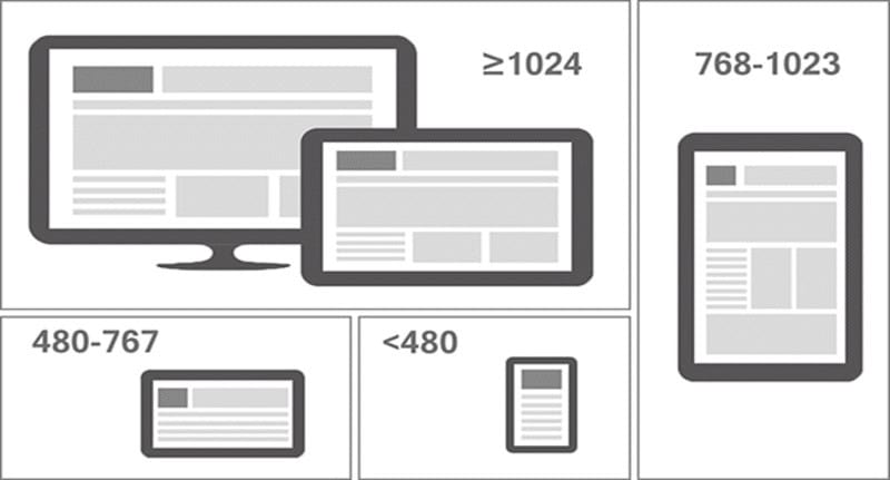
Fixed widths of websites are usually designed at 960px. This size is perfect for screens with a resolution of 1024 or higher, which is the standard for most computers today.
Fixed Layout is used on over 80% of websites compared to fluid layout sizes. It ensures consistency across different screen resolutions. This helps the designer control other display elements and prevents major disruptions to the site’s coding.
Advantages:
-
Easy to design and implement
-
Works well across different devices
-
Even at 800px, the website remains legible on high-resolution devices
-
HTML elements with fixed widths are easier and faster to implement.
Disadvantages:
-
Creates large empty spaces on high-resolution screens, which can hurt aesthetics
-
If the width is higher than the screen resolution, a horizontal scrollbar appears.
Fluid Website Size (Responsive Layout)
What is a fluid website size?
A fluid website size is calculated based on percentage values. This ensures that the website displays correctly across different devices, adapting to different screen sizes.
Fluid sizing uses percentages for HTML elements, so avoid using pixels. As a result, the layout can change according to the screen resolution.
My website, GTV SEO, uses fluid sizing. You can see the example below.
Advantages:
-
User-friendly, enhancing the website’s UX/UI score
-
No horizontal scrollbars or blank spaces, unlike fixed layouts
Disadvantages:
-
More limited in using graphics on the website
-
Image and video sizes need to be carefully calculated. Otherwise, alignment and arrangement can be difficult.
-
A design created on Photoshop may look perfect, but on another device, it can become distorted.
-
Devices with high resolution may create empty spaces between text, reducing user-friendliness.
See more products: Buy advertising accounts
Other Website Sizes
1. Slider Image Size on the Homepage
The ideal size for a website slider image, according to the golden ratio, is 1360 x 540 pixels.
2. Image Size in Articles
For illustrations displayed outside, the size should be 300 x 188 pixels.
The image size within an article is 600 x 375 pixels.
3. Product Image Size
The best size for a product illustration image is 300 x 400 pixels.
The detailed product image size should be 600 x 800 pixels.
4. Website Sharing Size on Facebook
Social sharing, especially on Facebook, is essential for SEO. It helps your customers interact with your website more effectively.

When sharing on Facebook, you should set the website’s cover image to 1200 x 630 pixels. Alternatively, a minimum of 600 x 315 pixels will also work, and the image size should be less than 8MB.
You can also upload images from your computer or phone. The minimum aspect ratio should be 600 x 315 pixels.
Tools to Resize Website Images
Here are some tools that can help you resize website images. Using these tools will speed up your work.
-
Adobe Photoshop: A popular software for graphic designers and photo editors. However, using Photoshop requires some knowledge to complete tasks effectively.
-
Paint: Yes, you read it right. Paint helps you quickly resize images.
-
Direct Editing in WordPress: In WordPress, you can resize images when posting or in the “Library” section. Optimizing this helps your website run much faster.
How to Resize in WordPress:
-
Upload the image to the website using the “Add Media” button.
-
Select the image you want to upload.
-
When inserting it into a post, choose the “Size” option.
-
In the “Size” section, you will have three choices: “Thumbnail,” “Medium,” and “Full Size.” Select “Medium.”
-
Finally, click “Insert into Post.”
You can also explore online image editing tools:
-
Pixlr: A convenient image editing tool with various effects and filters. It supports most image formats like PSD (Photoshop), PXD, JPEG, etc.
-
Fotor: A free tool for online image editing, allowing you to add filters, frames, text, stickers, and more.
-
Canva: A well-known tool that makes designing images, banners, logos, and more easy. You can drag and drop graphics, fonts, and more that are already available.
Conclusion
Above are the best website size practices for SEO and UX/UI.
If you need the most reputable payment method and advertising account provider, you can message the fanpage buybm365.com-Ads to receive advice from HT Media. In addition, you can follow the articles. Latest articles related to our Digital Marketing.


